The Ultimate Guide for Mobile Branding
Nowadays, almost no one can live without a mobile device. The number of users who have this tool and download apps is impressive and has been increasing over time. In fact, according to statistics, at the beginning of 2021, there were about 3.5 million apps available in the Google Play Store, while the Apple Store had about 2.2 million. This translates into many competitors trying to promote their apps. So if you want to see your app shine, keep reading these 9 mobile branding strategies to help you stand out!
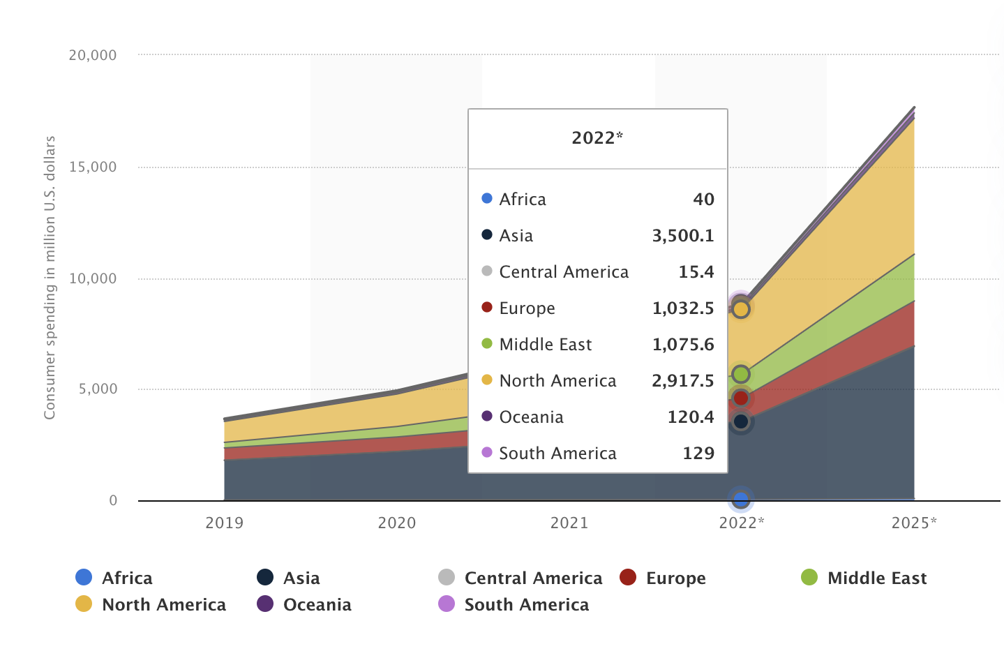 Consumer spending on mobile social apps worldwide
What Do We Mean by Mobile App Branding?
Before we begin with the strategies, you need to know what mobile branding is. Most people confuse the term branding with marketing. This is far from the truth.
Marketing and branding are two distinct concepts. They are closely interlinked but not the same. Instead, they move parallel to each other. It is challenging to do one without the other in today's world of fierce business competition..
Marketing can be done in several ways and is more about promoting the products in the short term. Branding is done in the long run. It is about building relationships with customers to increase the company's value over time.
Branding is done by creating distinguished characteristics around a business. For example, unique illustrations or funny ads can have a significant impact when it comes to remembering a specific company. Think about Coca-Cola. The red and white logo of the company must come to mind. The logo is a standout feature of Coca-Cola that connects people to the company.
In the same way, you need to create some distinct characteristics and features related to your business that will put your company's name in people's minds. The distinctive features can be several things like colors, sounds, music, logos, a motto, your mission, and more. With these unique features, your brand will be instantly recognizable in your market. Think of a sound or logo your brand represents and use it as much as possible.
Why is Mobile App Branding Important?
According to statistics, more than 85% of Americans use a mobile phone. And this is just in one country. People all over the world are hooked on their phones. They use their mobile device for leisure, fun, work, education, and more. For all these things, there are apps.
As we’ve mentioned, mobile app usage is on the rise, and it is not slowing down. With most of the world on mobile phones, businesses are jumping at the opportunity to create mobile apps.
Another statistic shows that more than 62% of small businesses have already built a mobile app for their business. This indicates that the competition is high. You need to get proactive if you want your mobile app to have a chance at surviving in this crowded space.
Branding Strategies for Mobile Apps
Branding is the way to stand out from other mobile apps. Here are the top tactics you can use to start branding and scaling your mobile app business:
- Choose the name of the app
- Write a creative tagline and slogan
- Build a logo and icon
- Implement UX writing or copywriting
- Create other related graphics
- Spread the word on social media
- Provide excellent customer support
- Offer rewards via referrals
- Build a landing page
1. Choose the Name of the App
One of the first steps to developing the branding of your app is the name. This attribute will help people identify you and will also help you differentiate yourself from your competitors and establish yourself in the market. Undoubtedly, this process deserves time and consideration. There are certain factors that you must take into account when choosing the right name.
1) Check that there is no other mobile application with the same name
ProTip: Search for the name of your application in the Google Store and the App Store to check if there is an app that already uses the name you have in mind.
In case it’s already taken, try to add variants of the word or add extra words that highlight the attributes of your app.
Let's take the famous "to-do" apps as an example.
- One of the most popular ones on the market is "Microsoft To Do: Lists & Tasks".
- A variation made by another developer is "Simple To Do List & Task".
- An app with a differentiator is "Kids ToDo List," which is designed and customized for the little ones to be able to complete their routine in an entertaining and age-appropriate way.
2) Check that a matching web domain is still available
Later on, we will talk about building a landing page, but for now, as you are about to choose the name of your app, we recommend you think about a web domain.
We suggest using Google Domains to check if the domain you have in mind has already been taken. If it’s available, Google will present you with the domain prices so you can buy the right one for you.
2. Write a Creative Tagline and Slogan
Before we continue, you should know that although a tagline and a slogan may seem the same, the reality is that they are slightly different.
A tagline is one of the first foundations of your app, so it focuses on highlighting and/or describing what your app does and how it helps. Therefore, it tends to be longer (in terms of the number of words) and even prevails over time.
Conversely, a slogan tends to focus on communicating the advantages or features of certain products or campaigns. Therefore, it tends to change over time. Likewise, another of its differentiators is that they are usually shorter, catchier, and more memorable.
An example that helps us clarify this is Netflix:
- Tagline: At Netflix, we want to entertain the world.
- Slogan: “See what's next.”
In both cases, your mobile app's tagline and slogan will set the tone for how people perceive your mobile app. Therefore, they should be simple, catchy, and easy to pronounce. Don't choose complicated or wordy phrases; the ideal number of words ranges from 3 to 8.
You can try this Free Slogan Maker by Shopify to start giving shape to this valuable branding element.
3. Build a Logo and Icon
A logo is one of the most important and necessary resources for creating a brand. It represents your mobile app and helps people recognize your brand. Your logo is what people will see when they open the app and will help them recognize the app when searching for you. So, it needs to be unique, appealing, and memorable. Each detail counts. You need to get the perfect colors and shapes for your logo. In fact, app design guides emphasize that the first impression users get from your application largely depends on the color choice you've made.
For this task, the easiest way to create your logo is to hire a professional designer. But you can also get in touch with your inner creator and do it yourself using templates to create a compelling logo. However, before designing your logo, you should know that there are different types; here, we explain them briefly so you can figure out which style is more suited to your mobile app:
Name-based logos
As the name suggests, these types of logos are made up of pure text. Most of these logos usually have initials, abbreviations, or short words. It is also important to emphasize that including colors, shapes, typographies, sizes, and spaces is key to differentiating them from other logos. There are three types you can choose from:
- Wordmarks (Logotypes). Their main differentiator is that they only contain letters and nothing else. An example is a technological giant, Google.
- Letterform. They only have one letter, which can be your mobile’s app first initial. This type of logo is generally not the official logo of a brand but a variant. Think, for example, of the Notion logo.
- Lettermark (Monogram). These are similar to the previous ones but contain 1 to 3 letters. Generally, it is for brands with long names who wish to abbreviate them and those wishing to be in international markets—for example, IBM.
Image-based logos
These logos have more openness since they include images and graphics accompanied by text to give a more creative touch to a mobile application.
- Abstract. Abstract logos are mainly composed of images, but if you choose this logo, consider that the graphics are not real elements but rather metaphorical or invented—for example, the XBOX logo.
- Combination Mark. This may be the most common logo since it comprises images and text. Think of the logo for Kapwing, for instance.
- Dynamic. As its name indicates, these logos are dynamic because they usually modify some aspects according to seasonality or with certain campaigns/events. Think, for example, of Samsung, which generally makes slight variations to its logo in summer or at Christmas.
- Emblem. They are easily identified by their emblems, shields, symbols, and badges. Like the Warner Bros. logo, they symbolize history, power, and prestige.
- Mascot. They are easily identifiable because they have a character that can be a person, an animal, or a mythological being—for example, the Duolingo logo.
- Pictorial Mark (Brandmark). These logos only have images from the real world, as they may have an icon or symbol, usually taken from the primary logo. However, this can only be used for companies that already have a presence in the market. Otherwise, no one would recognize them. If you are looking for an example, think of Apple and its classic apple.
4. Implement UX Writing and Copywriting
The UX writing of the app is the way to communicate – through words – with the users. All the written text in the app is an essential part of branding. In this case, words are your most powerful ally to communicate and connect effectively with your users.
UX writing is a form of copywriting. People might turn away and not even check your mobile app if it is complicated and confusing. The UX writing part should describe what your app does in easy and plain language that everyone can understand. Know and hit the issues that your users face and attract them with your words.
Likewise, the inside of the app should also have smooth UX writing. People should be able to figure out where all the options are and how to move to new and different pages on the app. You should run an app test with a group of people that can give feedback before launching.
Here are some concrete actions you can take regarding UX writing to improve your mobile app branding:
- Write short sentences and double-check there are no typos or phrases that don’t make sense.
- Use vocabulary your target audience knows/identifies with.
- Make sure your writing style and tone are the same in all the areas of your app.
- Be clear about what you want your users to do. For example, give concise instructions through CTAs (calls-to-action) such as "Download now."
- Think of what your users would like to see/read on your app.
- Be human, and give a fun/creative touch to your copy.
- Get inspired by other apps that are similar to yours.
- Pay attention to your users' feedback and enhance your text.
- Use colors, sizes, and fonts to emphasize the essential aspects.
5. Create Other Related Graphics
In the process of branding a mobile app, the logo is not the only graphic that counts. You need more illustrations, such as themes, icons, videos, and images to complement and give more strength to your text and make your app's interface more attractive.
The key is to think carefully about these graphics, so that behind each one there is an intention that helps elevate the brand awareness of your app. If you do it right, people will quickly recognize your app just by looking at the style of your graphics. Some of the different graphics you will need to think about are:
Theme
The illustrations will help establish the central theme of your app, as they give it a more substantial virtual presence. At the same time, they create the right atmosphere and help your audience connect with your app through the graphics and colors that express what you want to convey. The BetterMe app, for example, uses soothing and relaxing colors - in tune with healthcare - that make you feel that way from the moment you open the app.
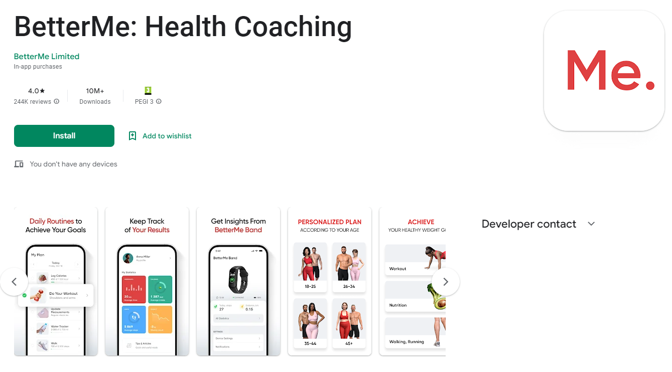
Screenshot taken from play.google.com
Rewards
While most may think of stars or trophies, graphics help us find creative ways to give rewards to our users. For example, Netflix's new SpongeBob game includes a treasure chest, simulating Mr. Krabs' famous Krusty Krab, that provides coins for completing particular challenges. There are also rewards for playing the app, which come in the form of SpongeBob's grandmother's cookies.
If you are a fan of this series, you will know what we’re talking about and if not, notice how the illustrations are 100% related to the theme of the app. The point is to find unique ways that align with what your app does to captivate your users.
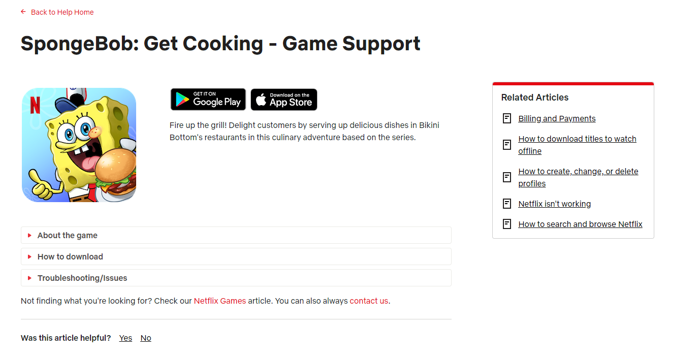
Screenshot taken from netflix.com
Onboarding
This is one of the first steps to show users how your app works or how they can get the most out of specific challenges or tasks, highlighting the functionalities or features you offer. So, again you will need to make use of graphics to explain the process better. You can resort to videos, which are more visual, to help the user understand how to use the app. This comes in handy when users prefer to avoid lengthy texts.
Entertainment
Undoubtedly, when you have an app, there will be certain moments when you need to entertain your users to keep them in the application. Sometimes, you need to put in certain pauses to load all the content smoothly, and we know that nobody likes to wait. Therefore, you can use an example that comes in handy: Animal Crossing Pocket Camp by Nintendo. This app had the brilliant idea of making the wait more bearable, adding graphics that show tips, features, inspiration, and even available offers or new products through beautiful illustrations.
 Screenshot taken from imgur.com
As you can see, visual content adds a big plus to your mobile app. And as we have mentioned, it is crucial to maintain visual consistency in our mobile branding process.
6. Spread the Word on Social Media
Social media is the hub of branding in the world of digital technology. According to statistics, about half the world's population, or 4.62 billion people, use social media on some device and in some form.
Many people on social media channels use it to discover helpful apps and businesses. So, if you are not making your presence felt on social media, your brand is losing out to the competition. Today, it is no longer a choice for businesses whether to be or not to be on social media. It’s crucial to your business’ success.
Most people search on Google or on social media search engines to find the products, apps, services, or other things they need. Take action and implement these steps to help your app stand out on these platforms:
- Ensure you have updated social media channels with clear and correct information about your app.
- Optimize your social media by doing SEO and posting helpful information.
- Add eye-catching graphics and product videos.
- Stick to the color theme of your app.
- Add a direct link to your app in your social media profiles.
- Give rewards to your users for connecting their social networks with your app or even for recommending it through a review.
- Provide content your audience genuinely likes. For example, demos, upcoming features, news, how-tos, and FAQs. If in doubt, use analytics to determine which content your audience enjoys the most.
- Venture into paid advertising to get more downloads.
- Create a hashtag, invite users to tag you in their creations or how they use your app, and use that same user-generated content to post online.
- Say yes to contests to get people to try your app or use the premium features you offer.
#ProTip: Color synchronization gives people a better feel of a unique and memorable brand. In short, keep consistency across channels when creating your social media content.
7. Provide Excellent Customer Support
Branding is centered around people. It takes into consideration how people will connect with your company to make them loyal customers. Besides being a quality app, great customer support is another way to ensure customer loyalty.
And while we know that the world of customer service can be challenging, here are some valuable tips you can implement so that your app provides top-notch service.
- One obvious step that many people overlook is listening carefully to provide effective solutions. The most important thing is that the customer feels heard; make them feel that their voice has value and that you are willing to solve any inconvenience in the best way.
- Another good practice is to make everything clear so your users can serve themselves, whether through a forum, a FAQ page, or by providing all the tools and information they need.
Note: from time to time, ensure your information is precise and updated to avoid any inconveniences.
- Also, you shouldn't underestimate that many users prefer to do everything without leaving the app. So ensure you have available and quick assistance to avoid bad reviews. (If you’re after more advice on how to boost your ratings read this article on 5 Ways to Achieve 5 Star App Reviews).
- Just as we mentioned that you have to be consistent in the visual aspects, you also have to be consistent in customer support. Make sure your content is in tune with the tone and style of your app and include the human side. We often prefer to talk to a real person who can solve our problems rather than to a robot that may not understand what we want.
- If someone wants to cancel some cost functionality, kindly find out why. These comments will give you an idea about what you should improve and implement in your app.
- Rely on other platforms (Facebook, WhatsApp, Twitter, Instagram) to keep supporting your users.
- Evaluate your metrics to determine the number of support requests, response time, average resolution time, customer satisfaction rate, and cancellations.
- Lastly, if you are receptive to the issues people are facing with your app and guide them through it, there will be a higher chance of people sticking around.
8. Offer Rewards via Referrals
Giving out rewards for referrals is a great way to increase brand visibility. Make it easy for people to share the app with friends and family and offer rewards for doing so. Rewards could include discounts, free points or items, memberships, gift cards, and more.
Your brand visibility and engagement will increase as more people learn about and download your app.
9. Build a Landing Page
A landing page on your website will redirect users to the app download link. It should be built with brand colors, a concise description of what it does for the users, and a clear call to action.
Still, there is more. To get the best out of your landing page, try to implement the following:
- Customer testimonials.
- Social media links.
- QR codes to open your app in one click.
- Use headings to highlight what your app can do for users.
- A footer with resources such as customer support, blog, terms of service, policy, and even job opportunities or a "partner with us" section.
- Include videos and graphics to make your content more dynamic.
- A section to describe your best features.
- Don't be afraid to implement A/B tests to check out what actions have a better conversion rate when downloading your app. Test your images, texts, and CTAs.
- If your app is well-known enough, add a section to the companies/influencers that have talked about your app.
- Try a pop-up so people can subscribe to your email list to send them valuable tips and encourage future app downloads.
- Also, if you consider it convenient, add a FAQ section.
Check out Spendee’s app landing page below. They’ve done a great job and have implemented some of these recommended actions.
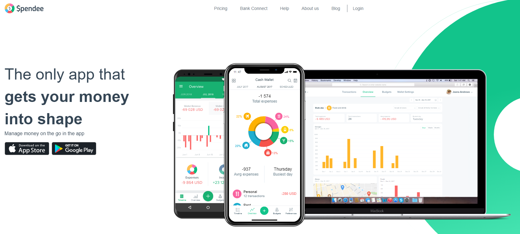
Screenshot taken from spendee.com
In the end, a well-built landing page can do wonders for your branding. Make it short, clear, attractive, and engaging for the users to read and, of course, mobile-friendly!
Wrapping up on Mobile Branding
Creating the perfect mobile app is not simple. Branding is the best way to distinguish yourself from the competition. If you do not make sure people recognize your app's unique characteristics, your business will suffer in the long run. People will not be able to find your app on their own.
You must take action and steps to promote your app in a way that sticks in people's minds. Mobile apps have a lot of opportunities and potential, but you have to grab them. Make a start with good branding.
Author Bio:
Valeria Santalla is a content marketer who loves to write helpful marketing insights for all business owners. She currently collaborates at Placeit, one of the internet's largest logo maker and design template libraries.

.png)
